
Project scope
Deliverables
Role & tools
The goal was to flex those UI muscles, conducting experiments with heuristics analysis and mid-fi wireframing. The focus was on refining clarity, enhance engagement, and giving the app a fresh aesthetic and new UI without changing the UX.


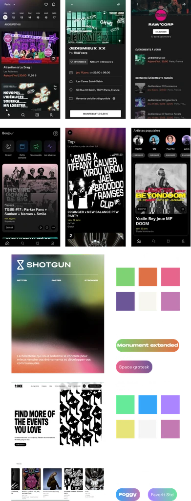
The homepage showcases sections to search for events, tailored recommendations, events for today, an option to connect to the user's spotify account, and popular events close to them.
The event page gives specific informations, allows alerts for tickets availability, displays the different types of tickets, the official reseller and a CTA for users to sell their tickets.
The artist page allows the user to subscribe to them, all of their events, a description of them, links to their socials, details of their genre of music and a suggestion of similar artists the user can browse and subscribe to.

Market analysis & inspiration
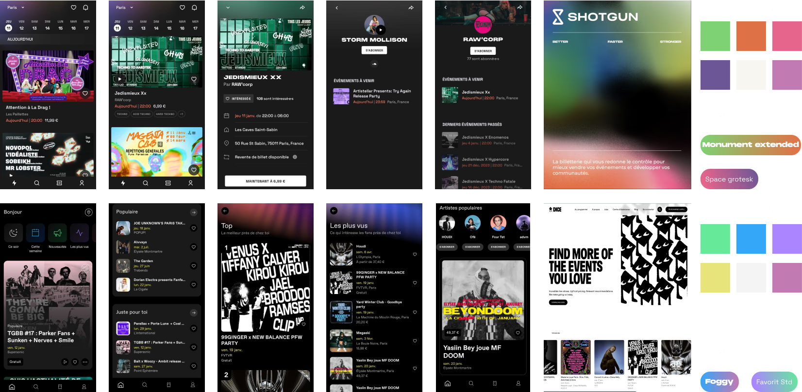
A thorough exploration of direct and indirect competitors like Shotgun, Fever, and Dice provided valuable insights into industry trends and successful branding strategies. The analysis aimed to identify compelling visual elements that could be adapted for Ticketswap's redesign.
I noticed a focus on dark mode interfaces, contrasting with neon and fun colors which is a great reminder of the atmosphere of events and concerts.
Every information is also more visually defined, which helps understand every action and information at a glance.
Ticketswap takaways
Homepage
lacked the engaging visual aid needed to captivate users instantly, important informations, such as the recommendations were displayed too low.
Information about dates and ticket availability was muffled, making it challenging for users to catch the rhythm of upcoming events.
Event page
struggled to showcase ticket availability clearly.
Critical details were lost, impacting the overall user experience and diminishing the anticipation.
Artist page
lacked clarity on the upcoming events and their respective availability
Branding & design system


Transforming Ticketswap from a bland design to a vibrant, night-oriented experience was the goal. The rebranding embraced dark mode, neon colors, edgy fonts, and dynamic light effects, evoking the vibe of a front-row experience. Fonts like Neue Machina and League Spartan, paired with a unique color palette, formed the foundation of the new brand identity.

Improving usability and interactions
This area, destined to help the user start their search of an event, was taking to much space and wasn't allowing actual strong recommendations to shine. Once the structure is optimized, the branding makes this suggestions usable without using too much unnecessary space.
Now that the recommendation section is displayed more clearly, we can make it even more interesting and interactive, by applying the branding, framing the informations within a ticket format and create an other way to navigate within the options by swiping.
The different events weren't readable, didn't pick the users' interest or made them want to interact. Transforming them into cards with ticket made them more enticing.
Many other transformations where created to make this app more fun and immersive, as you can see in the full prototype.
Final prototype
Takeways
This project was an interesting way to analyse what can be transformed to make a product more efficient, strong and user-friendly. Even thought the UX wasn't updated, the new UI allowed further explorations and more interactions with the users. It was globally very well received during the design critique.